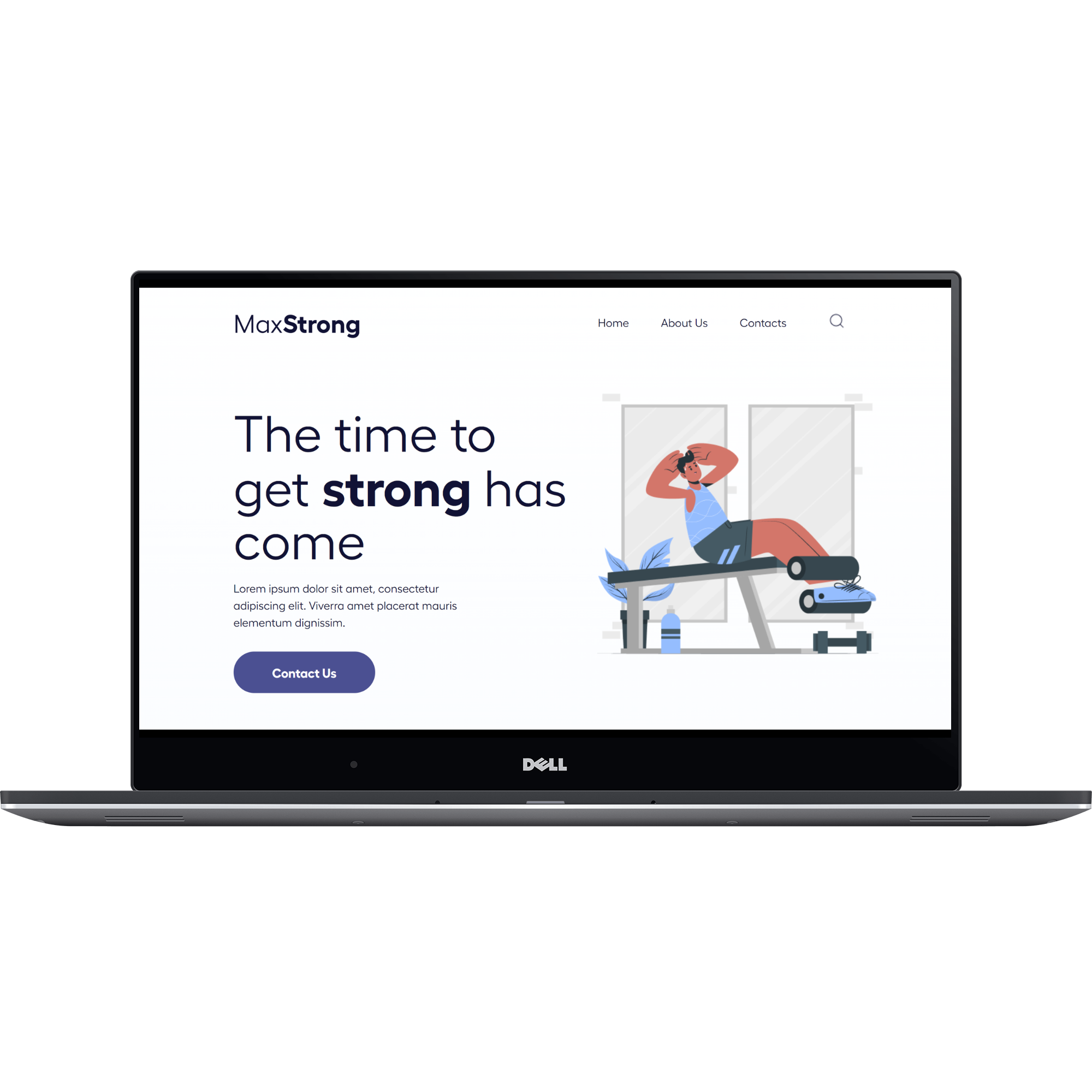
MaxStrong Landing Page
2022
View Site
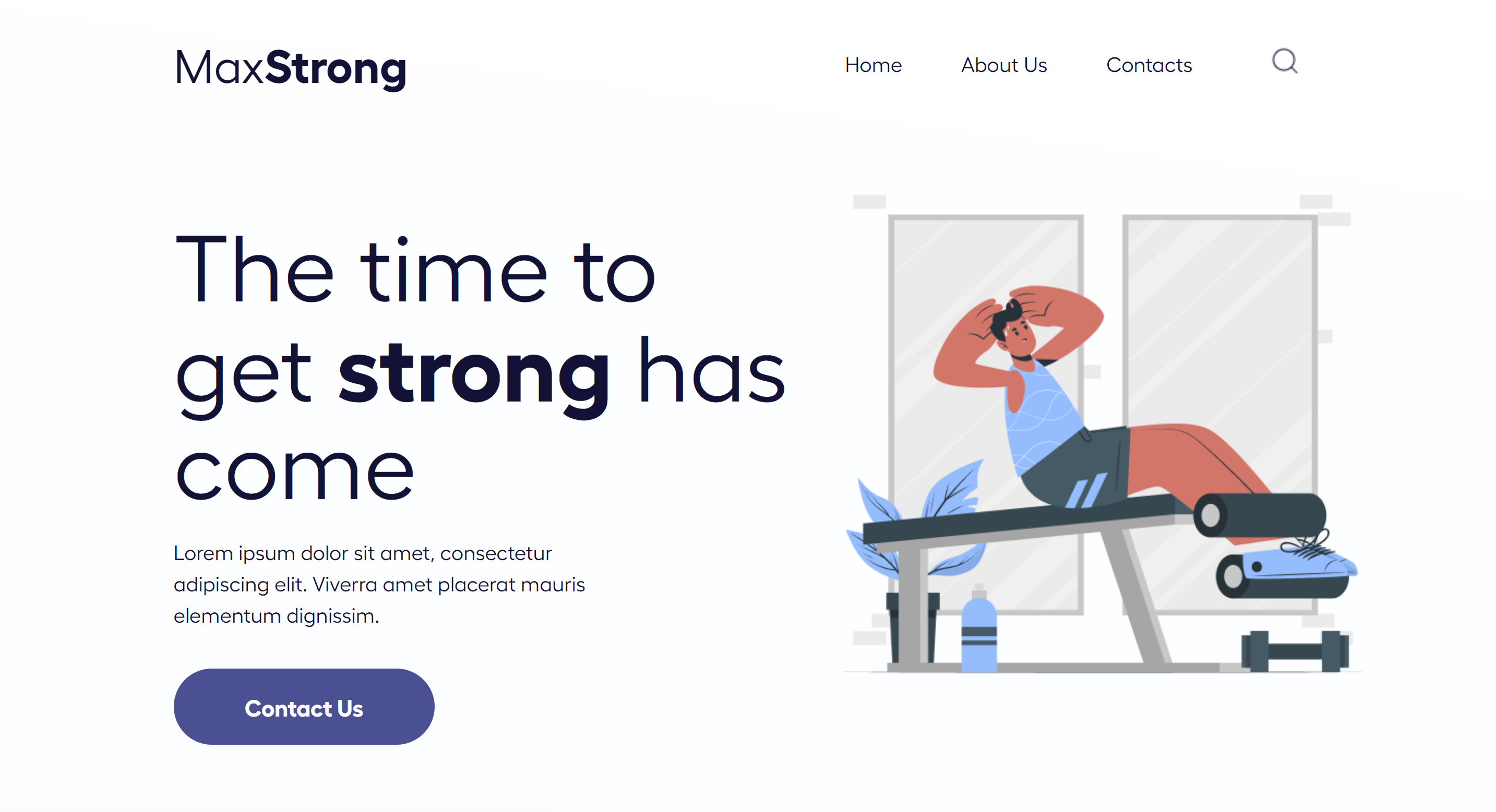
"Welcome to MaxStrong – where strength meets innovation and fitness transforms into an empowering journey."
Overview
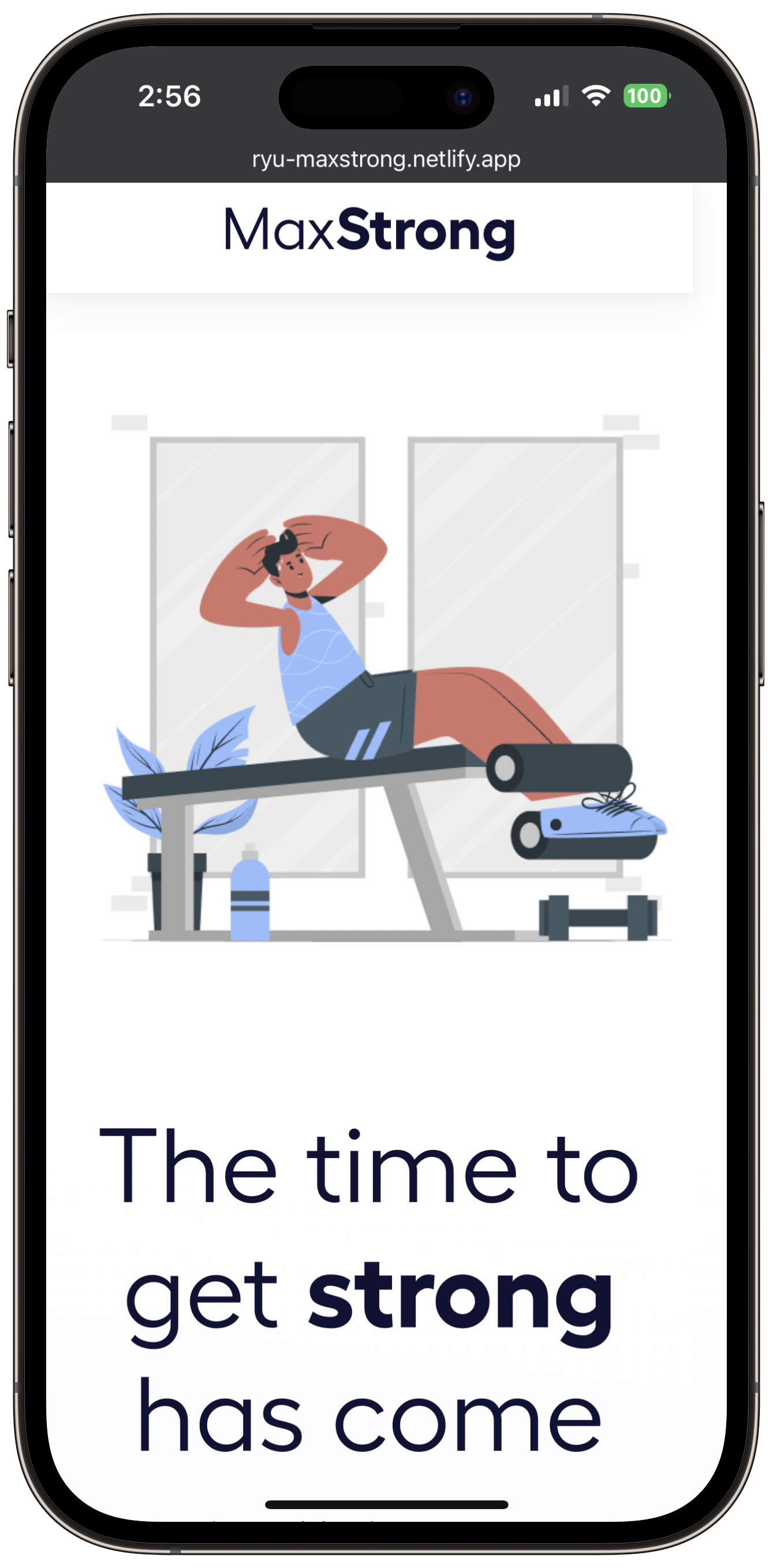
A landing page for our fantasy fitness brand MaxStrong created using HTML and CSS. The result is a page that resembles a minimalistic Shopify home page whose aesthetics are very easy on the eyes and would make a great landing page fit for any fitness brand, fantasy or not.
Features
Header and Page 1
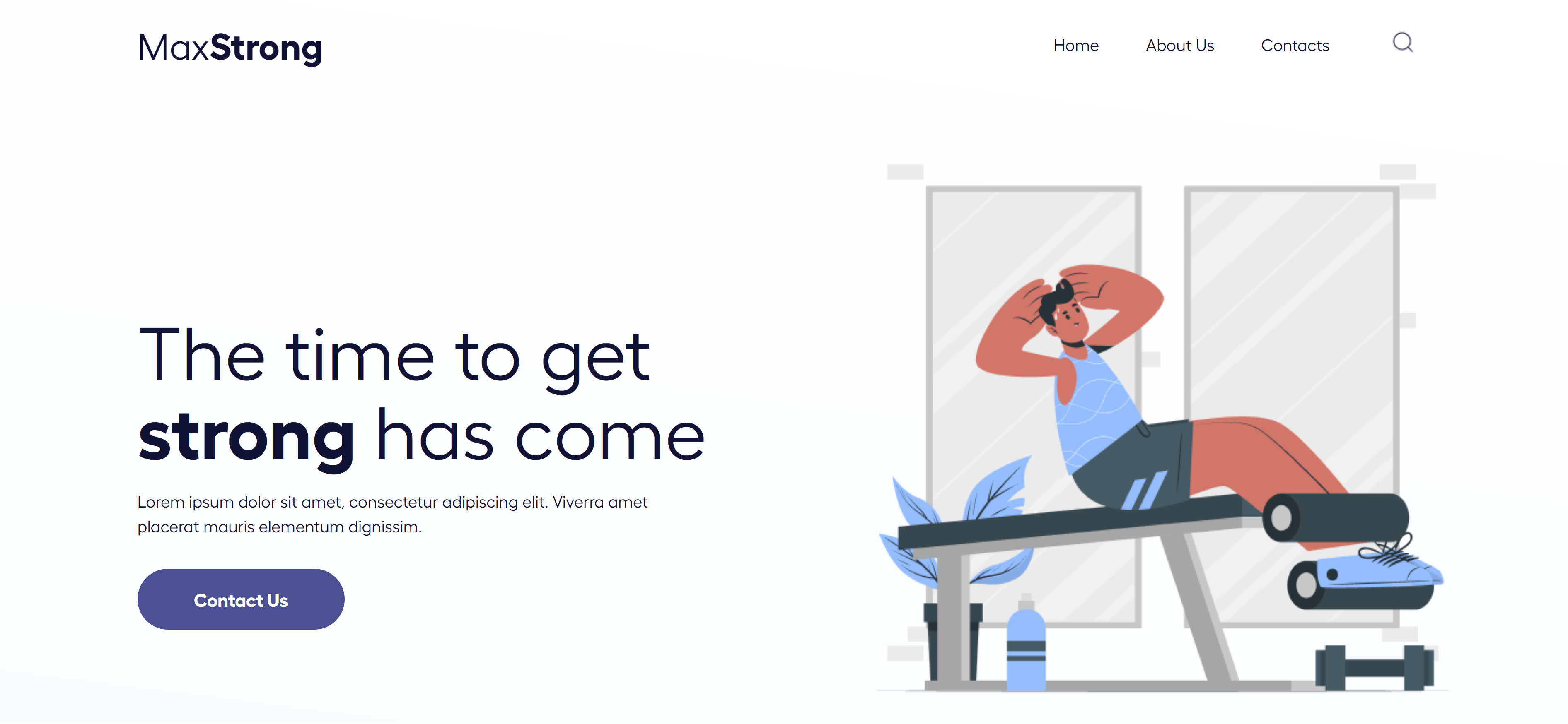
This landing page follows a very Shopify-esque design. The header has the classic look of the brand logo on the left and navigation links aligned on the right.
Page 1 resembles the image with text section in Shopify with a "Contact Us" button.
Page 1 resembles the image with text section in Shopify with a "Contact Us" button.
Page 2
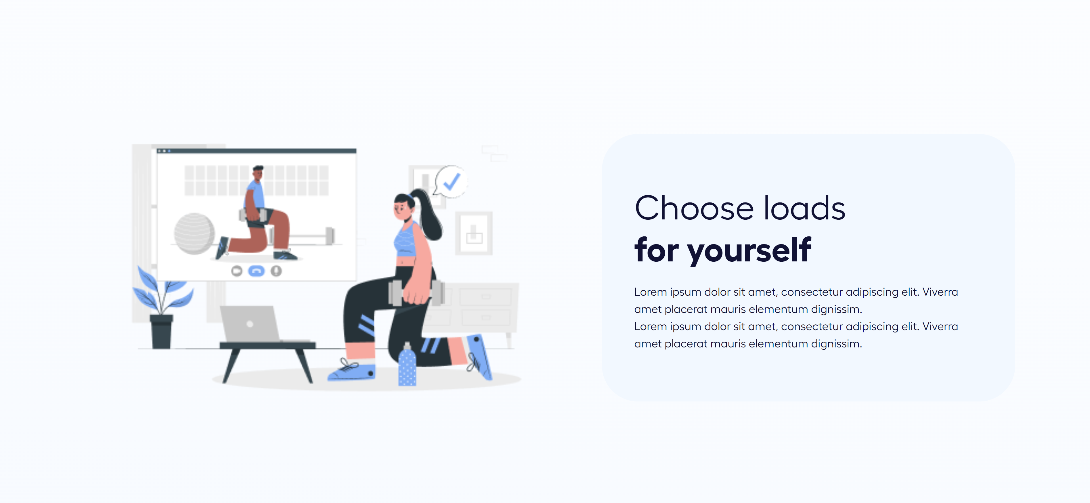
Page 2 is another image and text section.
Page 3
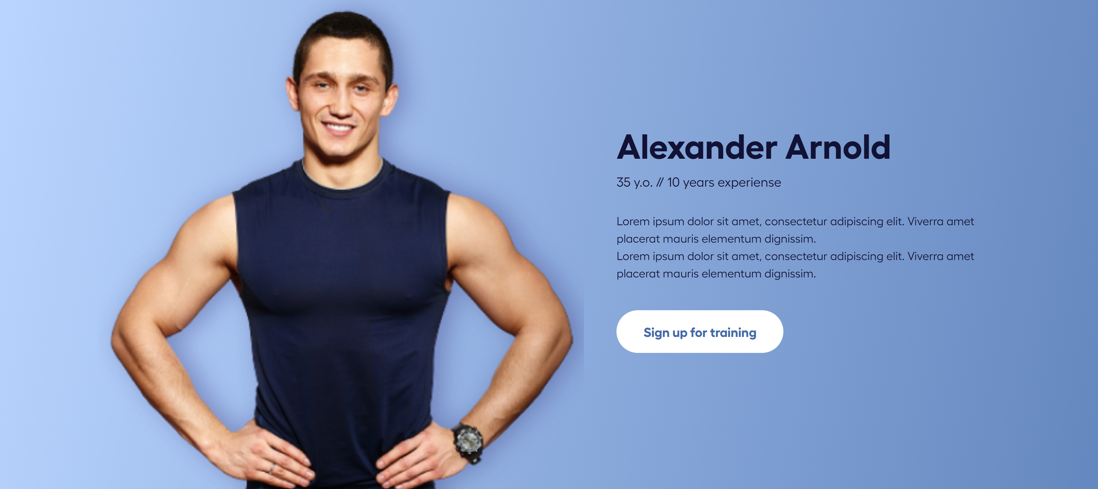
Page 3 is another image with text section but with an altered background color. This is similar to how we can change backgrounds for individual sections in Shopify.
Page 4
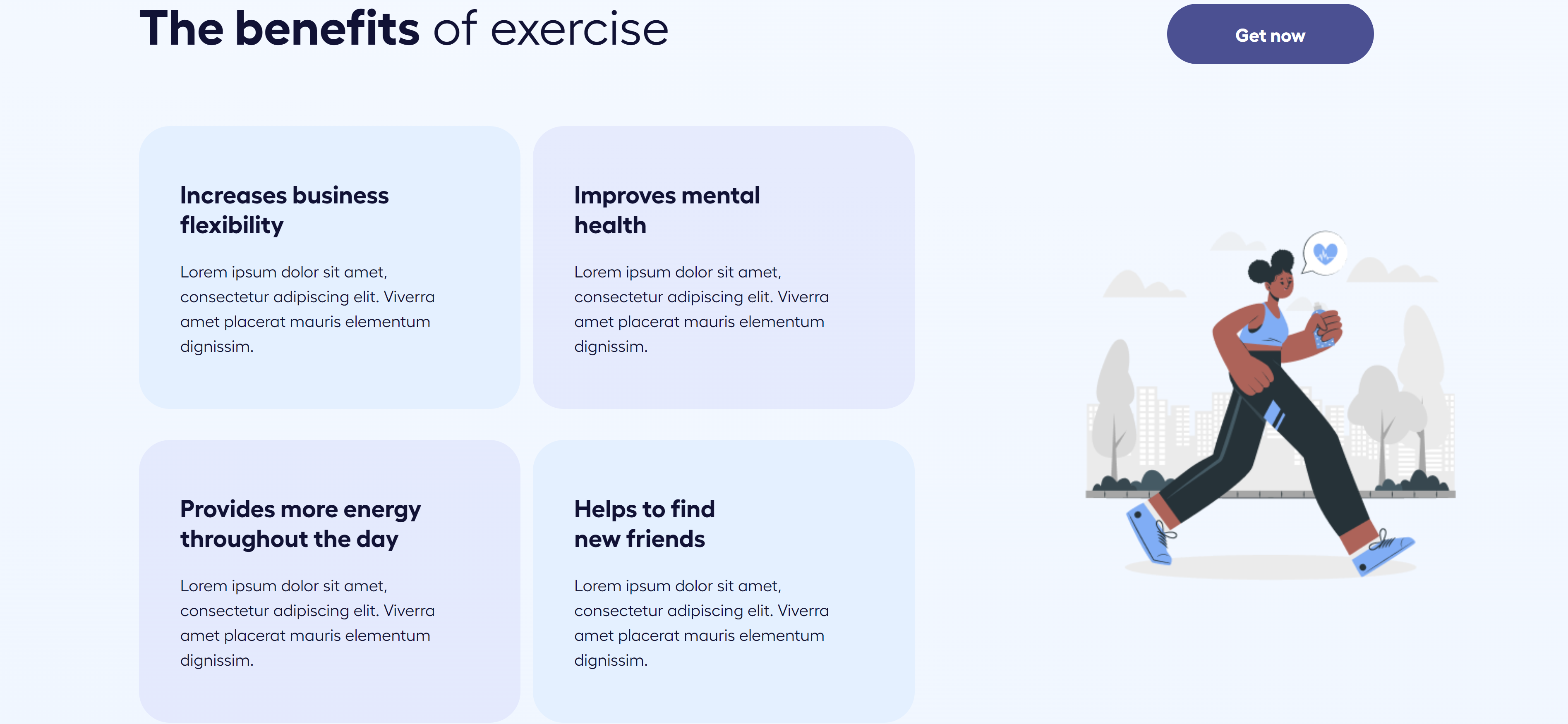
Page 4 consists of a grid used to advertise the benefits of exercise. This page is more complex than a typical Shopify section and isn't a usual feature that can be added using Shopify's platform.
Footer

Our landing page is complete with the typical footer with navigation links, email subscription form, and copyright info.
